


For general feedback about the game.
Steam SupportVisit the support site for any issues you may be having with the game or Steam.
It isn't often documented, but there tends to be a lot of cross-pollination of ideas across the various teams here at Valve. There are a lot of talented folks walking around the halls here, and it's incredibly helpful to show them things and get their feedback, because with each round of feedback we'll manage to solve a problem or even find some new inspiration. Case in point: When the Source Filmmaker team was working on ideas for what the "Meet the Pyro" would look like, one of the ideas stood out. Not only were we amused at the proposed world of the Pyro, but immediately were thinking of how much fun it could be to play inside it.
Of course, one of the immediate issues with this was how to bring the pastel color scheme and various whimsical storybook elements that made up Pyro's dream world into the textured world of TF2, with its more naturalistic palette and real-world setting. Achieving the Pyroland look would not only require creating a completely new texture set, but would have to be constrained both by texture memory and artistic resources.
Some of the things we ended up creating to solve this included, firstly, a replacement system that let us override the default textures in the game with an alternate version; and secondly, a new graphics shader system that we called "Pyro Vision". Here's what the final result was, but it took a few tries to get there.
One of the early suggestions for how to achieve the look of Pyroland in the actual game was to do a simple color correction over the whole scene. A quick prototype revealed a few things: funky psychedelic color effects could easily be achieved, but the color correction would also get applied to the players. Worse, the colors looked nothing like the palette in the "Meet the Pyro" short. While cost-effective, it didn't actually look very good, or come close to our original goal.
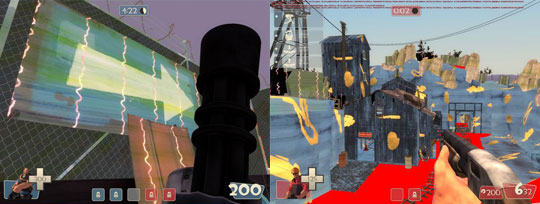
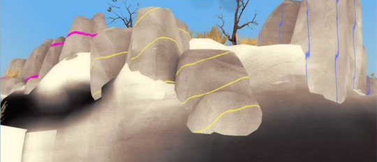
With the concept of the simple global approach being ruled out, the next option to explore was a custom graphics shader. Taking a closer look at the movie, two things stood out: the stripes flowing over the world, and the pastel/canvas look of the textures on the world. As a test we took an existing shader called "vertex lit generic" and hacked it to show what blending against a canvas texture might look like. In addition to this, we added a quick striping technique.
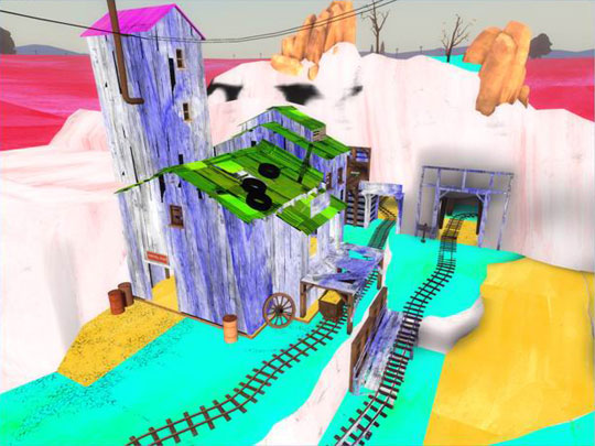
While still quite far from the look of Pyroland, it at least demonstrated that this direction might have some promise. Using this information, the artists did a quick paintover of a level image to help further refine the direction of the graphic shader's development.
The iteration of the graphic shader continued to focus on taking the original diffuse image, converting it to grayscale, tinting it, then applying this canvas style image under it. In game development it's not uncommon for programmers to create art assets that we affectionately label "Programmer Art." While we're still working with the lawyers to keep programmers away from anything artistic, it does end up serving a purpose. Sometimes it's used to spur artists to replace intentionally hideous art, while providing them with a gold mine of things to make fun of programmers for. In this case, it allowed us to explore various effects and represent how it would affect our daily playtests.
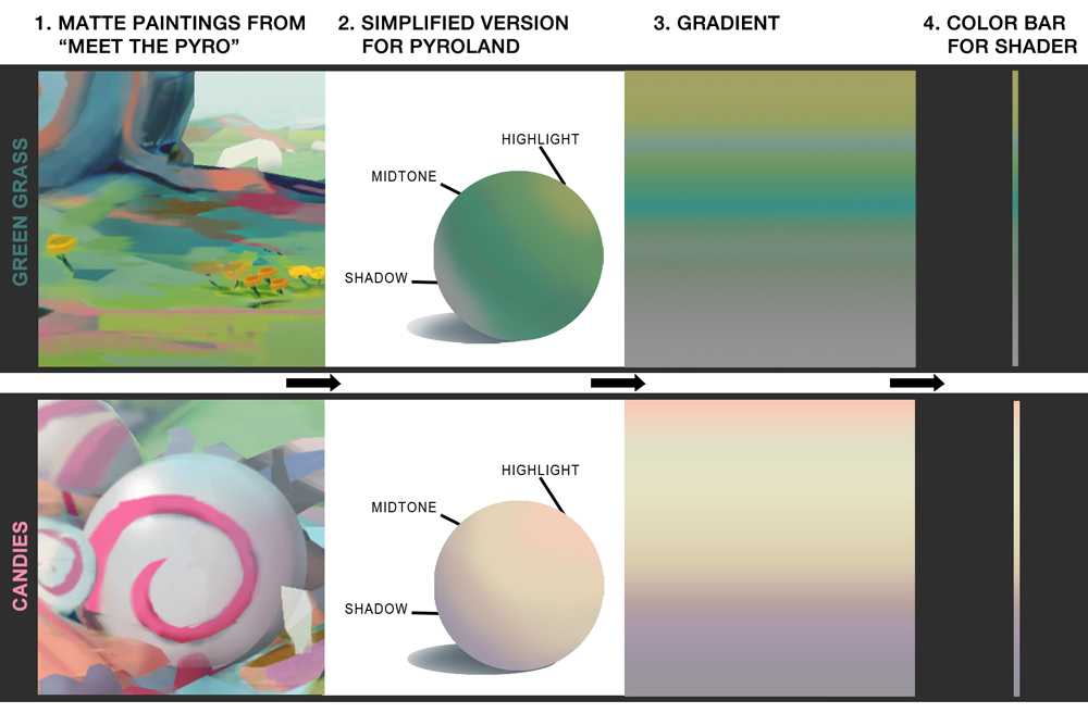
Artists like to keep programmers busy, so the next paintover iteration led us to a shift in the shader strategy. Rather than going to grayscale and then color tinting, if we were able to provide a color lookup texture against which the grayscale could be used as an index, it would give the artists a lot more flexibility. The alteration to the shader was very simple. The artist would provide a 1D texture (for our purposes, a 512x1 image) for the color lookup. The texture could be a single color gradient or multiple gradients. (They could even create a cartoon-like effect by making the gradient more abrupt.) The grayscale would be used as a texture coordinate against this, so that a dark gray would use colors from the left side of the color lookup, while white would be on the right side.
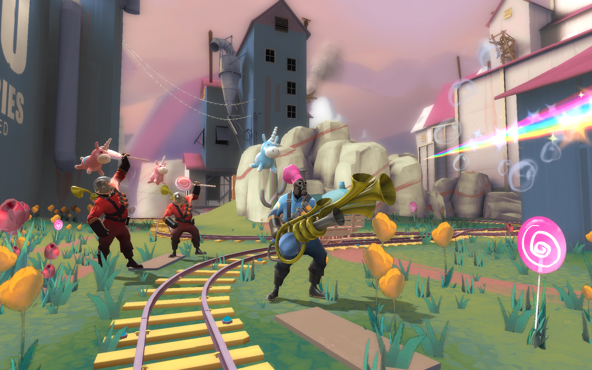
Using this approach we started to get closer to the Pyroland from "Meet the Pyro". Plus, since the artists only had to create a few common color lookup images, it also achieved one of our artistic goals in reducing the work load. The next thing we focused on was improving the striping effects. Again, with programmer art, we refined how the global texture coordinates were computed to generate the striping.
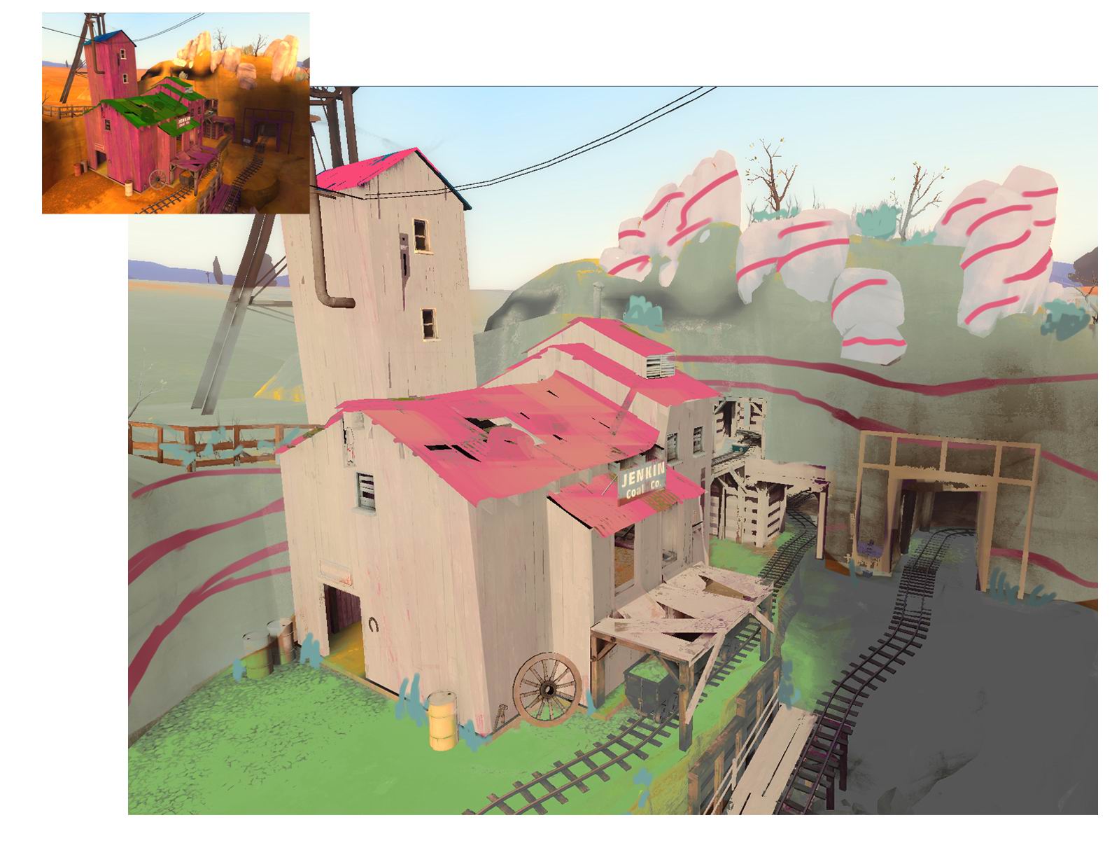
It was here where the look really started to come together into a cohesive image; but it still needed something more. We wanted to emulate the effect of bounced light into the shadows, which would contribute to the bright, soft feel of the world. With that goal in mind, we spent some time looking at the backgrounds the SFM team made for Pyroland, and ended up making our own version that we could use for the graphics shader.
This was accomplished by using color bars to create non-black shadows. The "shadow" section of the bar towards the left (see image) used a cool gray color. For the grass we kept the midtone through the shadow portion of a gradient from brilliant green to cool gray, and the highlight became a warm green that occured less frequently. For white we did something similar, but instead changed the shadows to a lavender/pink color, based on the effect of how light might travel through a milky white translucent object.
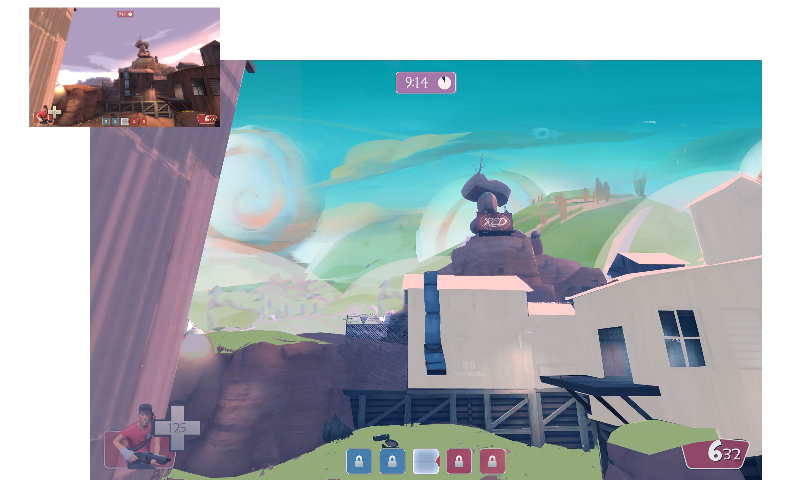
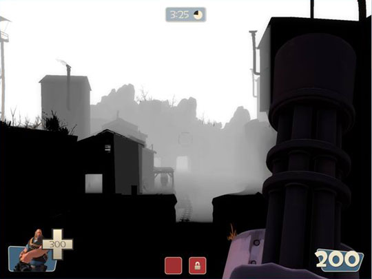
At this point, the graphics shader nearly had the ability to recreate Pyroland. We started focusing on some of the final details, which included depth of field. Below is an early demonstration of getting depth of field up and running, as well as a visualization mode to aid artists in tweaking the effect.
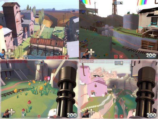
The remainder of the iteration cycle was spent on adding minor features and fixing various visual bugs (such as the entire world being rendered in Jarate at one point). Below is a selection of images showing the work in progress as the look of Pyroland continued to evolve.
The whole process came together surprisingly well, considering that the artists haven't been on speaking terms with the programmers since the programmers tricked them into playing SpaceChem ("It's sort of like Skyrim, but with more post-modern pointalism"). While we wanted to have coverage over the entire game, we ultimately ended up focusing on a tighter selection of maps in order to deliver a higher quality visual experience. It doesn't have to be that way forever, though! If you're interested in expanding Pyroland to the rest of Team Fortress 2, here's a wiki link explaining all the technical details on how it's done.
